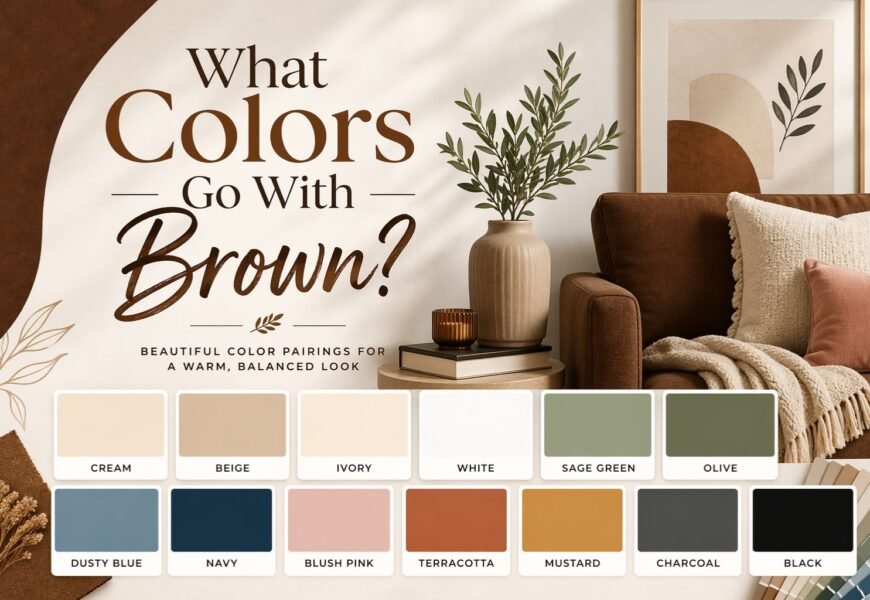
Brown is one of the easiest colors to live with, but it is also one of the easiest to get wrong. That is because brown is not just one color. It can be camel, taupe, walnut, chocolate, espresso, or soft tan. Some browns feel warm and golden. Others feel cooler and more muted. Once you understand that, the answer gets simple: the best colors that go with brown are cream, warm white, blue, green, gray, beige, mustard, blush pink, and black but the right choice depends on the shade of brown and the mood you want in the room.
Brown works so well because it acts like a grounding neutral. It can feel cozy, elegant, rustic, modern, or dramatic depending on what you put next to it. That is why designers keep returning to it in wood finishes, furniture, textiles, and paint.
Start Here: The One Rule That Makes Brown Easy to Style
Before you pick an accent color, look at your brown and ask two questions:
Is it warm or cool?
Warm browns usually have red, orange, or yellow undertones. Think cognac, caramel, chestnut, or chocolate. Cooler browns lean more gray or mushroom. Think taupe, greige-brown, or weathered wood. The safest approach is to either match undertones or create an intentional contrast with a color that balances them.
Is it light or dark?
Light browns make a room feel softer and more open. Dark browns feel richer, moodier, and more dramatic. If your brown is very dark, lighter wall colors and fabrics help stop the room from feeling heavy.
As a quick rule:
- Warm brown loves cream, olive, mustard, terracotta, and warm metals.
- Cooler brown works better with gray, sage, dusty blue, and greige.
- Dark brown usually needs contrast.
- Light brown can handle either contrast or tone-on-tone layering.
8 Colors That Go With Brown Beautifully
1) Cream and warm white
If you want the safest answer, start here.
Cream and warm white make brown feel lighter, cleaner, and more expensive without removing its warmth. This pairing works especially well with dark wood, brown sofas, and chocolate-toned walls because the light color gives the eye somewhere to rest. It is one of the most repeated recommendations across the SERP for a reason.
Use this if you want:
- a calm living room
- a bright bedroom with dark wood
- a timeless, easy-to-update palette
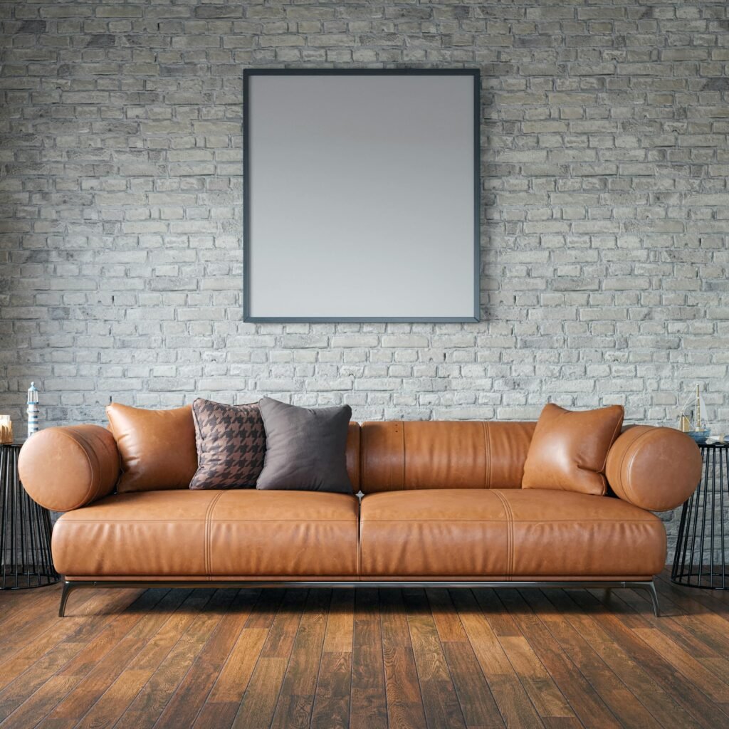
2) Blue
Blue is one of the strongest contrast colors for brown. Deep navy with chocolate brown feels classic and polished. Dusty or light blue with tan or walnut feels softer and more relaxed. Designers keep using this pairing because blue cools brown just enough to make it feel balanced.
Use navy if you want a moody, elegant look.
Use light blue if you want a fresher, more open feel.
3) Green
Brown and green almost always work because they already exist together in nature. Olive, sage, and dark green are especially strong with brown wood and leather. This combination feels grounded, organic, and calm. It can lean rustic, classic, or modern depending on the exact shades you choose.
If you want a room to feel natural and settled, green is one of the best choices you can make.
4) Gray and greige
For readers who worry brown may look dated, gray and greige are useful modernizers. Gray cools brown down and adds a cleaner, more tailored look. This works best when you pay attention to undertones. A warm brown with a cold blue-gray can feel off, but a soft warm gray or greige often looks elegant.
This is a good choice if you want:
- a modern living room
- brown wood to feel less heavy
- a neutral palette that still has warmth
5) Beige and taupe
If you prefer low contrast, beige and taupe are excellent with brown. They create a layered neutral look that feels calm and expensive when textures are mixed well. The trick is not to let every piece sit in the exact same tone. You want some separation between light, medium, and dark values.
Think:
- camel + oatmeal
- walnut + taupe
- espresso + sand
- tan + mushroom
6) Mustard yellow and gold
Mustard, ochre, and gold bring energy to brown without fighting it. Because these shades already carry warmth, they feel natural next to brown rather than sharp or random. They are great when a brown room feels too serious and needs life.
Mustard works well in:
- throw pillows
- artwork
- accent chairs
- lighting and metallic finishes
7) Blush pink
Pink may sound surprising, but soft blush with brown can look warm, gentle, and modern. Brown keeps pink from feeling too sweet, while pink stops brown from feeling too heavy. This pairing is often more elegant than people expect, especially with walnut, cocoa, or caramel tones.
Blush is especially useful in bedrooms, reading corners, and softer living-room palettes.
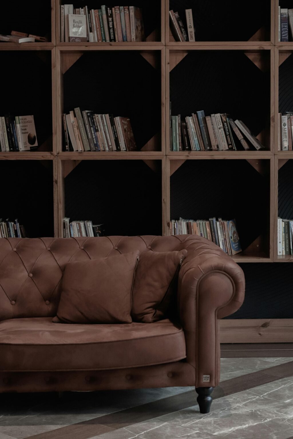
8) Black
Black with brown is bold, but it can look very polished when done well. The key is to let brown carry the warmth and use black in smaller, anchoring ways like trim, frames, lighting, hardware, or one strong furniture piece. This pairing shows up often in more dramatic interiors design. If both colors are dark, add cream, warm white, or natural texture so the room does not become flat.
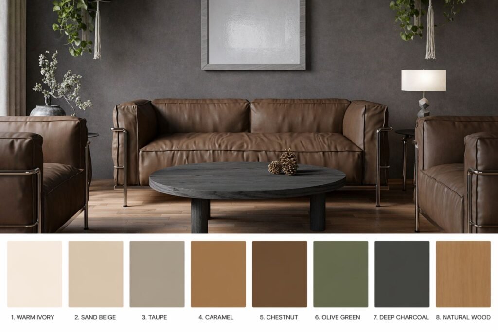
Best Colors for Dark Brown Furniture
Dark brown furniture can feel heavy if the rest of the room is also dark. The easiest fix is to bring in lighter surrounding colors and one or two clear accents.
The safest colors for dark brown furniture are:
- cream
- warm white
- sage green
- dusty or light blue
- soft gray
- beige
- brass or gold accents
For example:
- A dark brown sofa looks lighter with a cream rug and sage cushions.
- A walnut table looks cleaner against greige walls.
- A dark wood bedroom feels fresher with warm white bedding and muted blue accents.
If your room already has a lot of brown wood, do not add another heavy dark wall color unless you want a moody look on purpose. In most cases, contrast helps more than more brown.
Easy Brown Color Palettes You Can Copy
Here are a few simple formulas that work without much trial and error:
Calm and natural
Brown + cream + sage + natural wood
This is soft, easy, and hard to mess up.
Cozy and warm
Brown + beige + terracotta + brass
Best for rooms that should feel welcoming and layered.
Moody and elegant
Chocolate brown + black + olive + warm white
This gives depth without feeling cold.
Light and Modern
Walnut + greige + off-white + dusty blue A good option when you want brown to feel more current.
Colors to Avoid Pairing With Brown Too Quickly
Brown is flexible, but that does not mean every color works equally well without thought.
Very icy grays can sometimes fight with warm brown, especially if the brown has orange or red undertones. The combination may not look terrible, but it can feel slightly off.
Some bright purples and strong royal blues can also be harder to balance. They may work in certain styled spaces, but for most people they are less foolproof than olive, navy, cream, or sage.
Very harsh white can also be a problem. If the white feels cold and clinical, it may make warm brown look more orange or dated. Softer whites are often easier.
That does not mean these colors can never work. It just means they need more careful balancing. If you are decorating without a designer and want a result that feels easy and natural, start with the safer color families first.
How to Choose the Right Color for the Shade of Brown You Have

One reason people get stuck with brown is that they treat every brown the same. But brown can look very different depending on its undertone, depth, and finish.
A soft tan wall does not behave like a dark espresso sofa. A warm chestnut wood floor does not feel the same as a cooler taupe-brown cabinet. So before choosing a color, it helps to identify the exact kind of brown you are working with.
Light brown
Light brown usually feels soft, casual, and easygoing. It includes shades like tan, sand, camel, and some lighter oak tones. These browns are flexible and pair well with both warm and cool colors.
If you want a fresh, airy look, light brown works nicely with warm white, soft gray, dusty blue, or sage green. If you want a warmer and cozier look, pair it with cream, beige, muted terracotta, or mustard.
Light brown is often easier to decorate with because it does not dominate the room. It acts more like a soft neutral background, which means you have more freedom with accent colors.
Medium brown
Medium brown includes many common wood tones like walnut, chestnut, and classic brown leather. This is often the “everyday brown” people already have in furniture, flooring, or cabinets.
Medium brown is balanced enough to handle both contrast and blending. It can look elegant with navy, olive green, cream, greige, blush pink, or even black accents. If your room feels too plain, medium brown is a good base for adding color without making the space feel chaotic.
This is also the brown range where texture matters a lot. Linen, woven baskets, boucle, brass, matte black, and natural stone can all help medium brown feel richer and more styled.
Dark brown
Dark brown is bold, grounding, and dramatic. It can look luxurious, but it can also make a room feel heavy if everything around it is dark too.
If you have dark brown furniture, floors, or paneling, the best move is usually to create contrast. Warm white, cream, greige, soft blue, muted green, or even pale blush can help lighten the space. Dark brown also looks strong with black, but that pairing usually needs a third lighter color to stop the room from feeling flat.
A good rule is simple: the darker the brown, the more carefully you should control light, contrast, and visual breathing room.
Best Colors for Brown in Different Rooms
Brown does not need to be used the same way in every room. The right pairing often depends on how you want the room to feel.
Living room
In a living room, brown often appears in sofas, coffee tables, shelves, wood floors, or leather chairs. Because this room is used for relaxing and hosting, the best colors are usually the ones that feel balanced and welcoming.
Cream, sage green, soft gray, navy, and warm beige are some of the strongest choices for a brown living room. They help the space feel comfortable without making it look dull.
If your sofa is dark brown, lighter walls and textiles usually work best. If your brown is already light and warm, deeper accents like olive or navy can make the room feel more finished.
Bedroom
Brown can work beautifully in bedrooms because it already feels warm and restful. Brown wood furniture, woven textures, and soft neutral bedding create an easy foundation for a calm space.
For bedrooms, the most effective pairings are cream, oatmeal, dusty blue, soft green, muted pink, and warm taupe. These colors help keep the room restful while still giving it personality.
If you want the bedroom to feel more luxurious, use layers rather than loud contrast. Brown, cream, taupe, and brass can look especially refined when they are mixed with soft fabrics and warm lighting.
Kitchen
Brown in kitchens often shows up in cabinets, flooring, stools, or wood shelving. The goal here is usually to stop brown from feeling too heavy or dated.
Warm white walls, off-white backsplashes, black hardware, sage cabinets, muted blue accents, and natural stone surfaces all pair well with brown wood tones. If your kitchen already has a lot of brown cabinets, adding crisp contrast through counters, walls, or tile can help modernize the look.
Green is especially useful in kitchens because it brings life and freshness without clashing with wood.
Bathroom
Bathrooms with brown vanities, brown tile, or wood accents can feel spa-like when paired with the right supporting colors.
Cream, soft white, greige, sage, dusty blue, and charcoal are great choices. The key is to keep the palette simple and clean. In a small bathroom, too many dark or muddy tones can make the space feel crowded.
Brown often works best in bathrooms when it is balanced with lighter surfaces, mirrors, and good lighting.
What Wall Colors Go With Brown Furniture?
This is one of the most common decorating questions, and the answer depends on whether you want the room to feel brighter, warmer, or more dramatic.
If you want the safest wall color for brown furniture, choose warm white or cream. This works with nearly every brown furniture tone and gives you freedom to change decor later.
If you want the room to feel soft and modern, choose greige or a gentle warm gray. This gives a clean look without the coldness that some grays bring.
If you want a natural, relaxed feeling, choose sage green or a very muted earthy green. Brown and green together feel grounded and easy.
If you want more contrast, choose dusty blue or navy. Lighter blues create freshness. Darker blues create depth and elegance.
If you want warmth, choose beige, taupe, or a muted clay tone. These work especially well when the room already leans warm and cozy.
In general, avoid choosing a wall color that is too close to the furniture color unless you are intentionally going for a tonal, layered look. If the wall and furniture are too similar, the room can feel flat instead of pulled together.
How to Make Brown Look More Modern
Some people worry that brown feels old- Preppy Fashioned. The truth is brown is not the problem. The styling around it is what determines whether it feels dated or current.
If you want brown to look modern, focus on contrast, simplicity, and cleaner combinations.
First, pair brown with lighter neutrals like warm white, greige, or soft taupe. This instantly gives it more clarity.
Second, introduce a modern accent color like sage green, dusty blue, charcoal, or black. These colors help brown feel sharper and more intentional.
Third, use texture wisely. Brown looks more current when paired with materials like matte black metal, linen, stone, glass, boucle, and lightly textured ceramics.
Fourth, reduce visual clutter. A brown room can quickly feel heavy if it is filled with too many dark accessories, ornate shapes, or overly red undertones. Simpler styling helps brown feel cleaner.
Finally, use lighting well. Good lighting can completely change how brown reads in a room. Warm wood and chocolate tones often look far richer in soft, layered light than they do under flat overhead bulbs.
Easy Styling Tips That Help Brown Look Better Instantly
Sometimes the problem is not the color pairing itself. Sometimes the room simply needs better balance.
One easy fix is to add a lighter rug under dark brown furniture. This breaks up heavy visual weight and makes the room feel more open.
Another fix is to repeat your accent color in at least two or three places. If you use sage green, for example, let it appear in a pillow, a plant, and a piece of art. This helps the room feel more intentional.
You can also soften brown with natural textures. Linen curtains, woven baskets, light wood accents, ceramics, and greenery all make brown feel more relaxed and layered.
Metal finishes matter too. Brass, aged gold, and black can all look beautiful with brown. Brass usually warms it up. Black sharpens it. Chrome and silver can work, but they usually feel better with cooler browns.
Plants are one of the easiest partners for brown because they add life and color without introducing something that feels forced. Even a simple green plant can make a brown-heavy corner feel fresher.
Brown Color Pairings by Mood
If you are still unsure what to choose, think less about exact shades and more about the mood you want the room to have.
If you want the room to feel calm
Choose brown with cream, warm white, sage, soft beige, or muted blue. These colors create a peaceful and settled look.
If you want the room to feel cozy
Choose brown with taupe, mustard, terracotta, caramel, and warm neutrals. This makes the room feel inviting and layered.
If you want the room to feel elegant
Choose brown with navy, black, olive, warm white, or brass accents. These combinations feel richer and more polished.
If you want the room to feel modern
Choose brown with greige, off-white, charcoal, dusty blue, or matte black details. Keep the lines cleaner and the styling more minimal.
If you want the room to feel light
Choose brown with cream, pale beige, soft green, or light blue. This prevents the space from becoming too dense or dark.
Thinking this way makes decorating much easier because you are not just asking, “What matches brown?” You are asking, “What feeling do I want the room to have?”
That is often the better question.